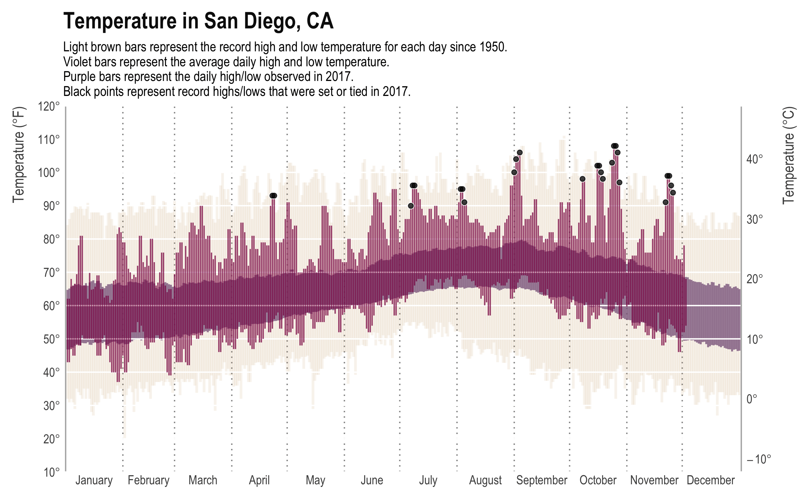
While the New York Times may have made the original, most data viz people will recognize the plot above from Tufte’s classic, Visual Display of Quantitative Information. It presents a ton of data in a clear, concise, and appealing way. The background bars show the record high and low daily temperature, the mid-ground bars show the “normal” (though as far as I can tell, normal is never clearly defined) high and low temperature, and the foreground shows the high and low for that year. In addition, we have annotations for days that met or made the record. The original plot even had a subplot for daily precipitation.
Here is a similar plot for Boston:
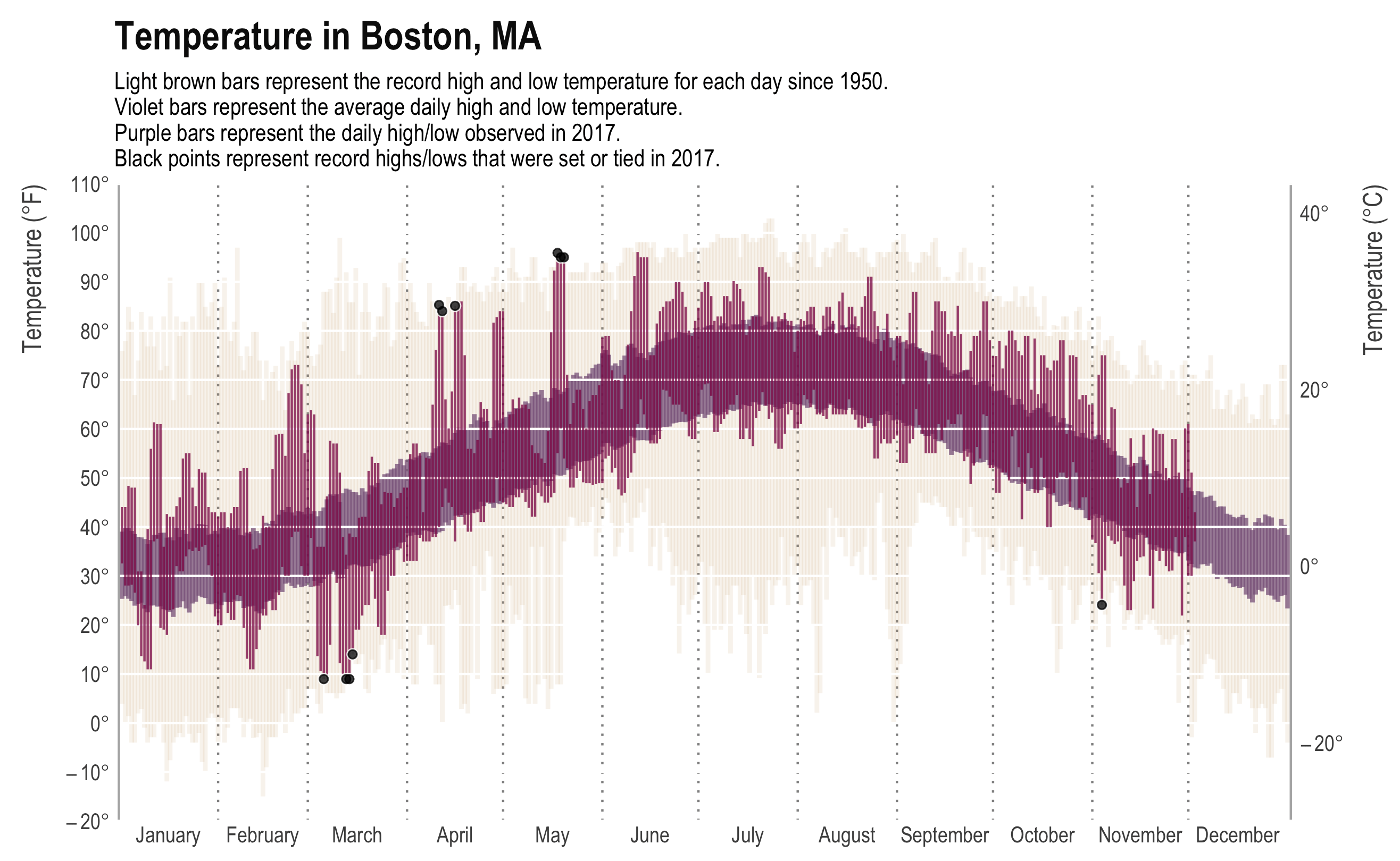
From all the dots, you can tell it’s been a hot year in San Diego. Boston, on the other hand, is unsurprisingly variable. The joke around here is if you don’t like the weather, you just need to wait a minute.
How about just average high and lows?
Let’s clear out the unnecessary data and just compare the expected highs and lows:
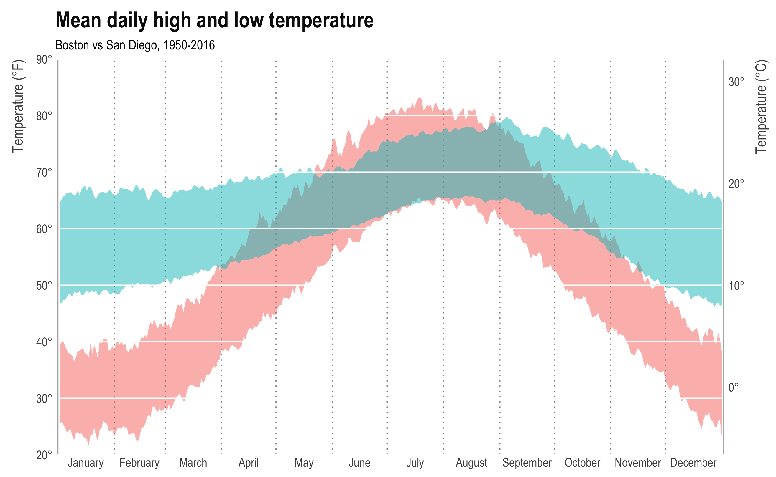 It’s not a competition, but if it were, San Diego would win. I didn’t bother putting a legend on here because… Boston.
How about rain and snow?
Let’s compare cumulative precipitation:
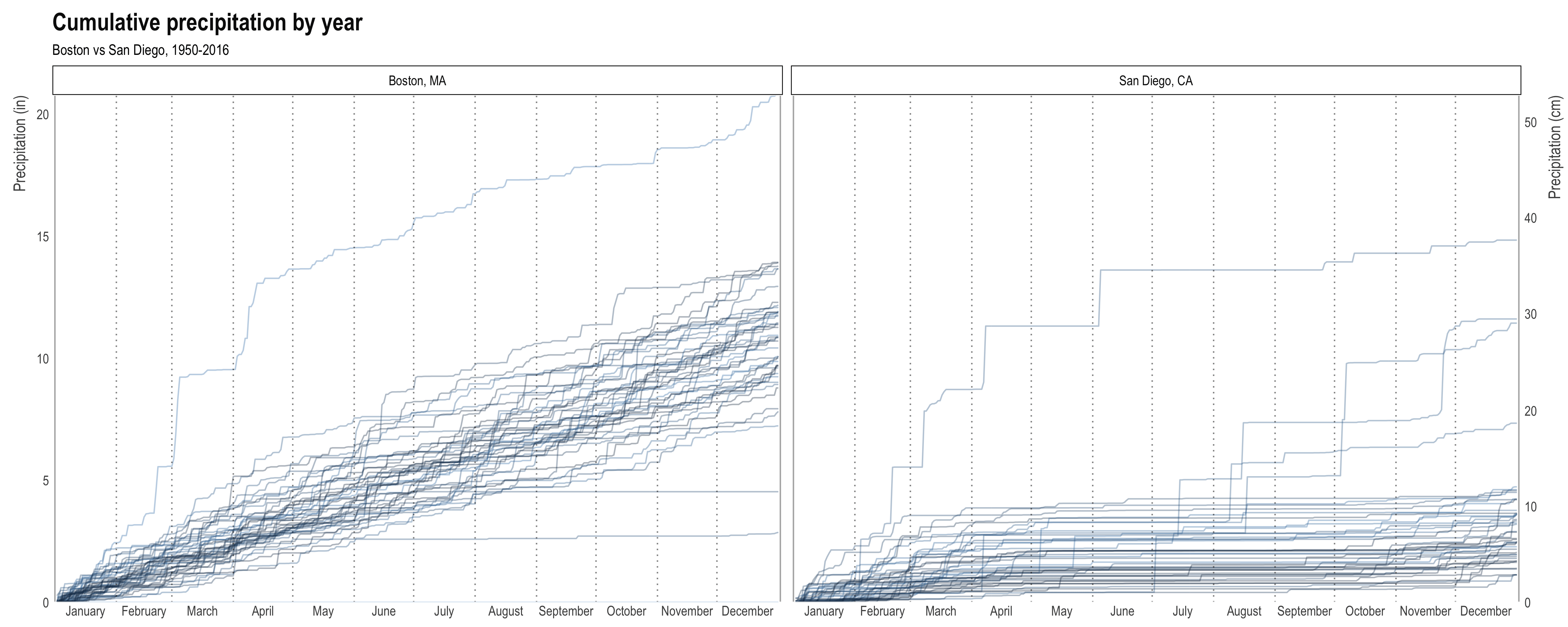 Each line is one year. Darker colors are more recent years.
+1 San Diego.
Worse part of Boston weather:
Despite the rain/snow and the crazy annual temperature range, what bothers me most about Boston weather is the insane daily variability. Below is a plot of daily temperature change for all 50 years. Again, each line is a year and darker lines are more recent years.
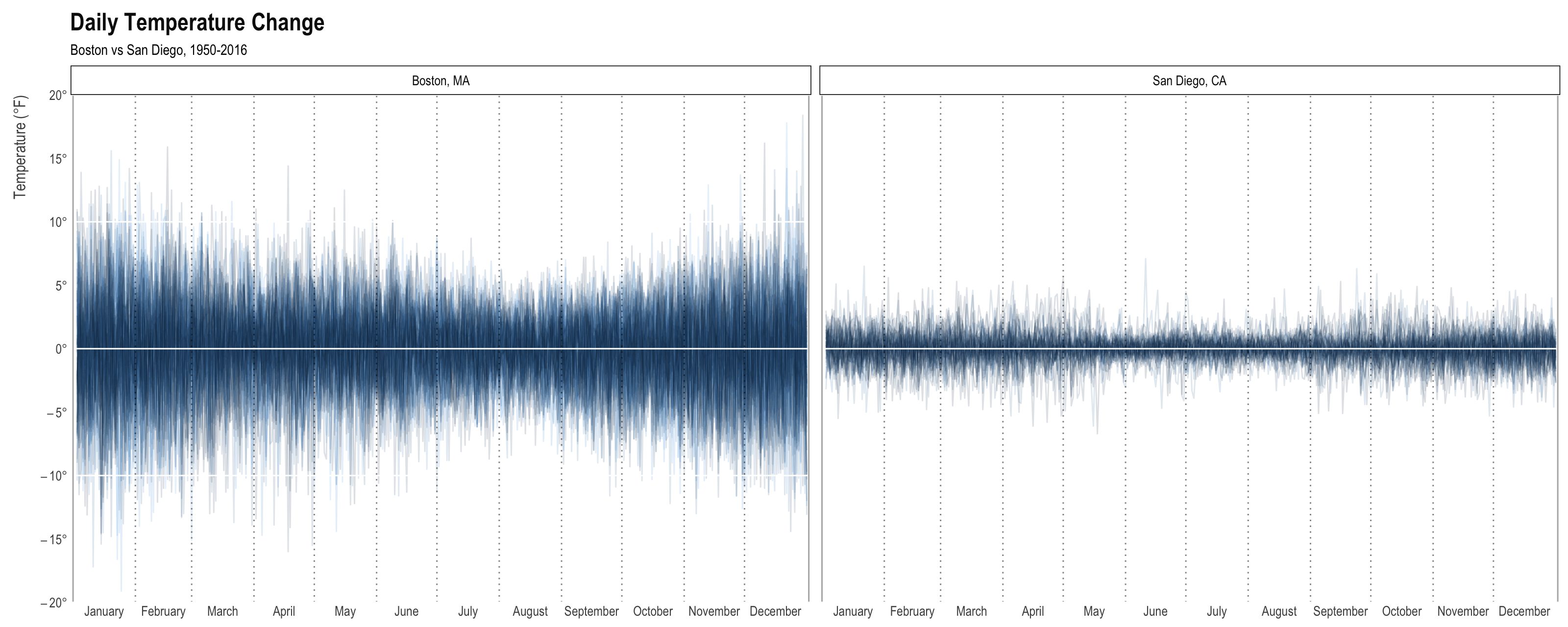
+1 San Diego.
Conclusion
San Diego has better weather than Boston.