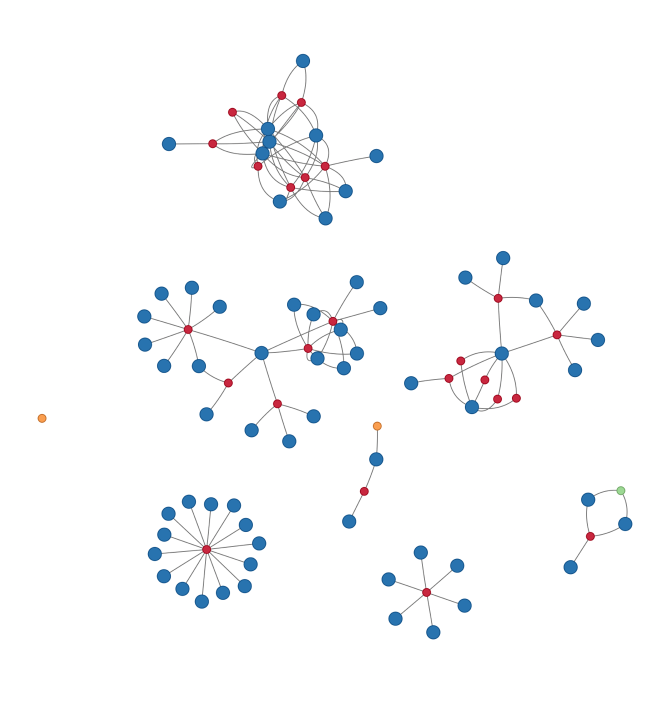
Hover over each node to see the name of the paper (red), co-author (blue), or other project (green for data and orange for software).
(Source page.)
(NOTE: Apparently, this won’t render properly on mobile devices. Sorry.)
Turns out it’s straightforward in R to pull from Google Scholar (via the scholar package) and visualize your collaboration network (via visNetwork). I’ve posted all the code up on a gist and it’s fairly self-explanatory so I won’t go into that part.
Random thoughts and things that surprised me:
- The completely disconnected components roughly correspond to different positions, research phases, or institutions. There are a lot more components than I had anticipated.
- In the center component is my time spent as a research assistant for Sara Singer in health policy and management. Sara is the hub of that component with spokes out to different groups of people. Not surprising given her work on interdisciplinary teams.
- In the middle-right is my previous (and still somewhat on-going) work with Nancy Krieger, Jarvis Chen, Brent Coull, and Jason Beckfield. They form a tight cluster and work together often (conditional on me also being a co-author on those projects).
- Middle-left is my time at NYU with Joseph Palamar and Perry Halkitis. Perry was head of a research center so he is fairly central in that component while Joey was my mentor (and Perry’s student) so all papers with Joey also have Perry on them.
- Then there are a few early collaborations — a couple stars and a line. Groups of people I don’t typically work with and/or am just starting to publish with.
- (Then there’s the isolate for an R package related to one of my dissertation papers.)
- It’s actually not as clear as I expected how I got from one component to another. Though that will likely change as many components will be connected as soon as one of my dissertation papers gets published.
- Maybe I really do lack focus on my research projects.
