As is always the case when I do this exercise, I can’t help but reflect back on 2022 (and 2021) with gratitude and appreciation for my amazing collaborators. It was my first year on the tenure-track and hours that normally would have been spent pushing research forward were instead spent getting my feet under me, taking on new students, hiring new postdocs, building up some community partnerships, shuffling through administrative tasks, etc. There’s a lot of things I enjoy about the job but by far the most enjoyable thing is working on things I think are interesting and important with people I like.
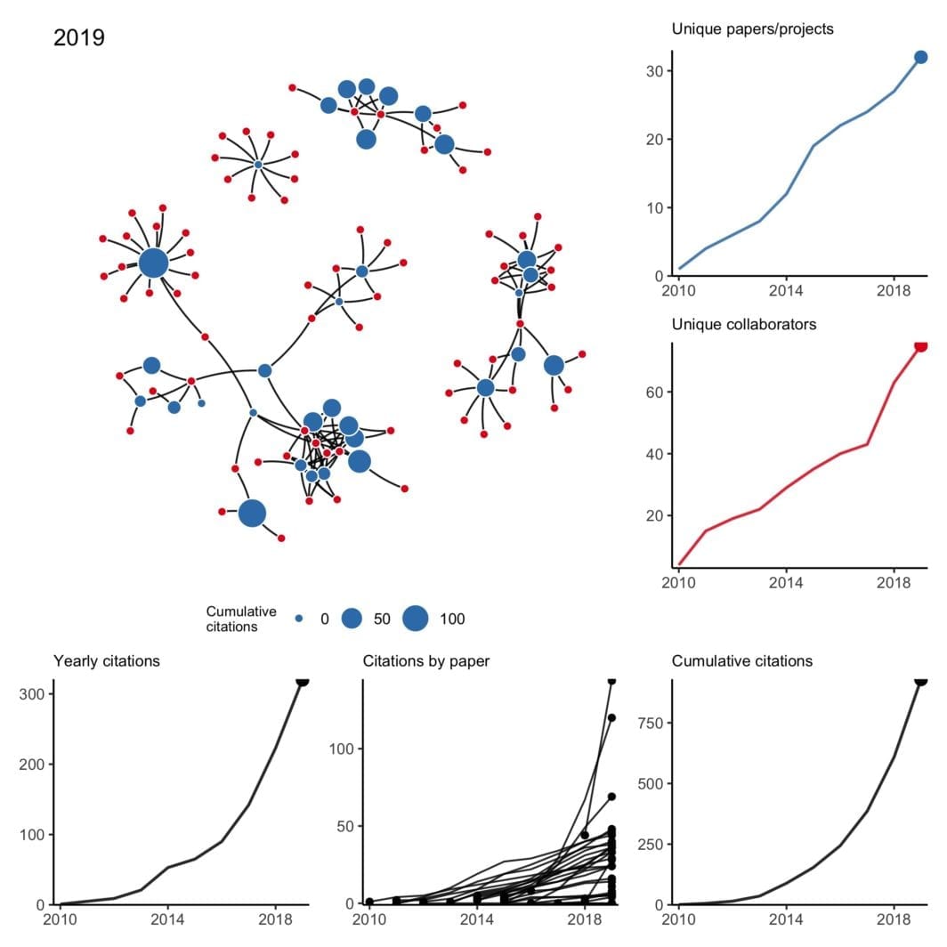
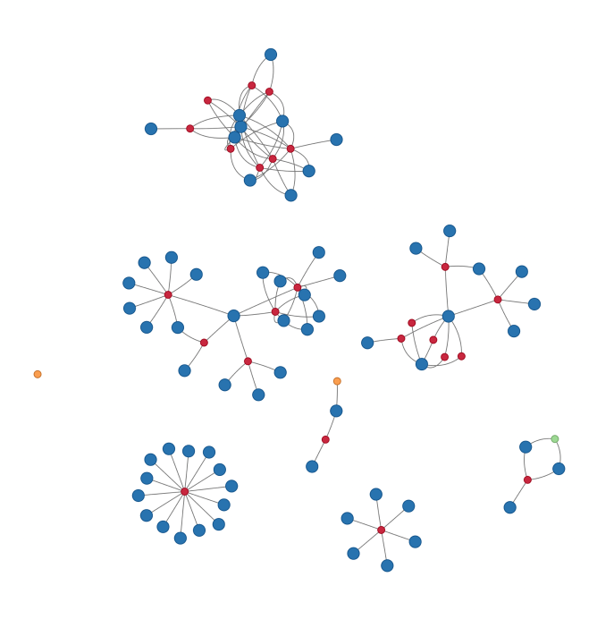
My collaboration network: 2010 to 2022 version
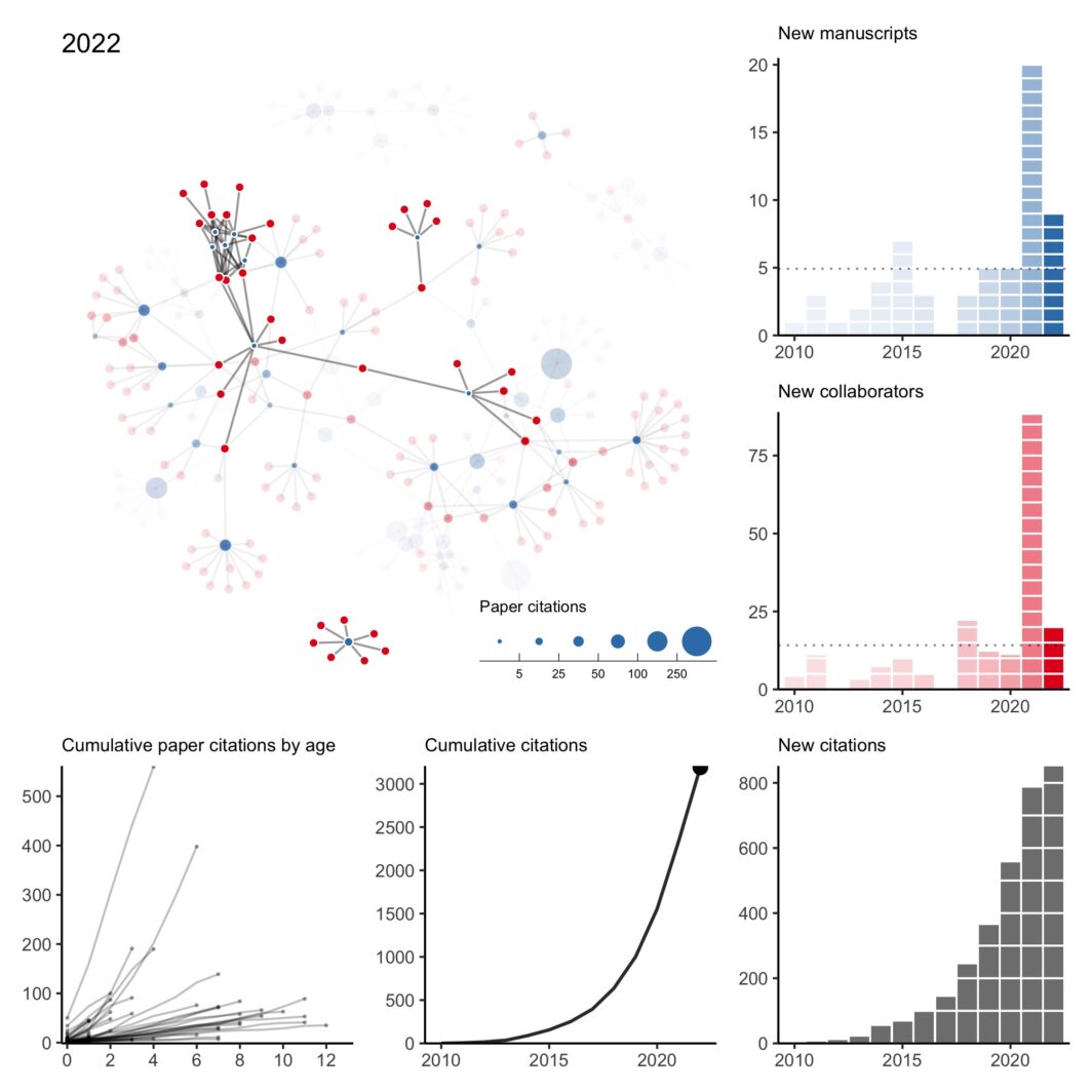
There was a lot going on last year and I missed my annual tradition of updating my collaboration network at the end of the year. However, thanks to a perpetual illness ravaging the house, I’ve found some sleepless hours to fix my old code and pick up the tradition again.
Plots of my biking in 2022
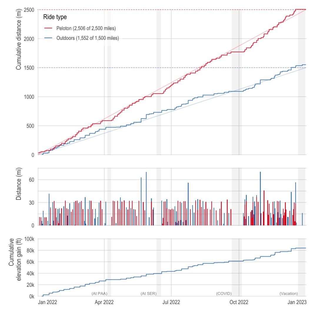
One of the best things about living in California is having amazing weather nearly all year long (the current 3-week-stretch-of-non-stop-rain aside). So last year, I decided to capitalize on the weather and made a New Year’s resolution to bike outdoors more. Specifically, I wanted to bike 1,500 miles outdoors in addition to my normal indoor biking of 2,500 miles. (Also, with a side quest of 100,000 feet of cumulative elevation gain.)
Below is a plot of my cumulative distance (and elevation) over the course of the year. I just barely got the distance resolutions with 1,551.7 miles outdoors and 2,506.1 indoors. I missed the elevation resolution by about 16,000 feet (ending at 83,899 feet).
It finally happened — I got COVID
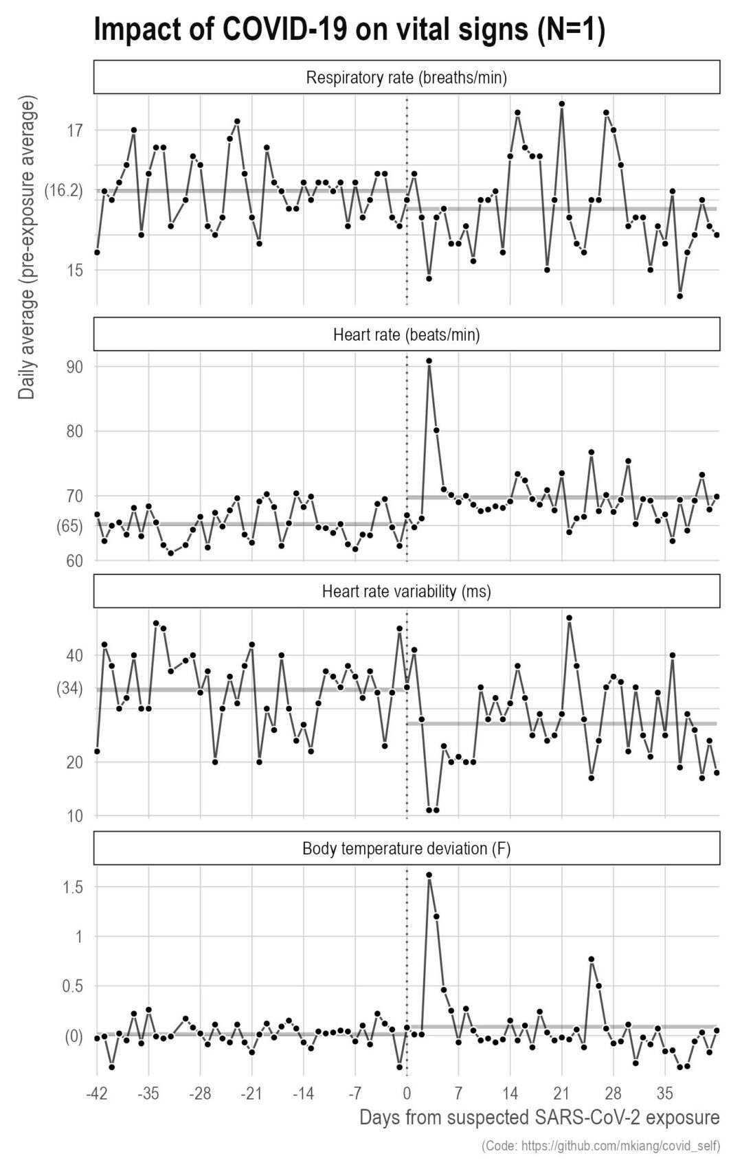
Last September, I got COVID. It was wildly unpleasant with serious brain fog that lasted for several weeks even after the other symptoms went away. That said, this did give me the opportunity to make some more plots based on my own data. Below, I show a few metrics of my vital signs (respiratory rate, heart rate, heart rate variability, and body temperature deviation) relative to my exposure (vertical dotted line) for six weeks before and after. The thicker grey lines in the background are the pre- and post-exposure averages for those six weeks.
Our paper looking at different COVID-19 testing/quarantine strategies for air travel
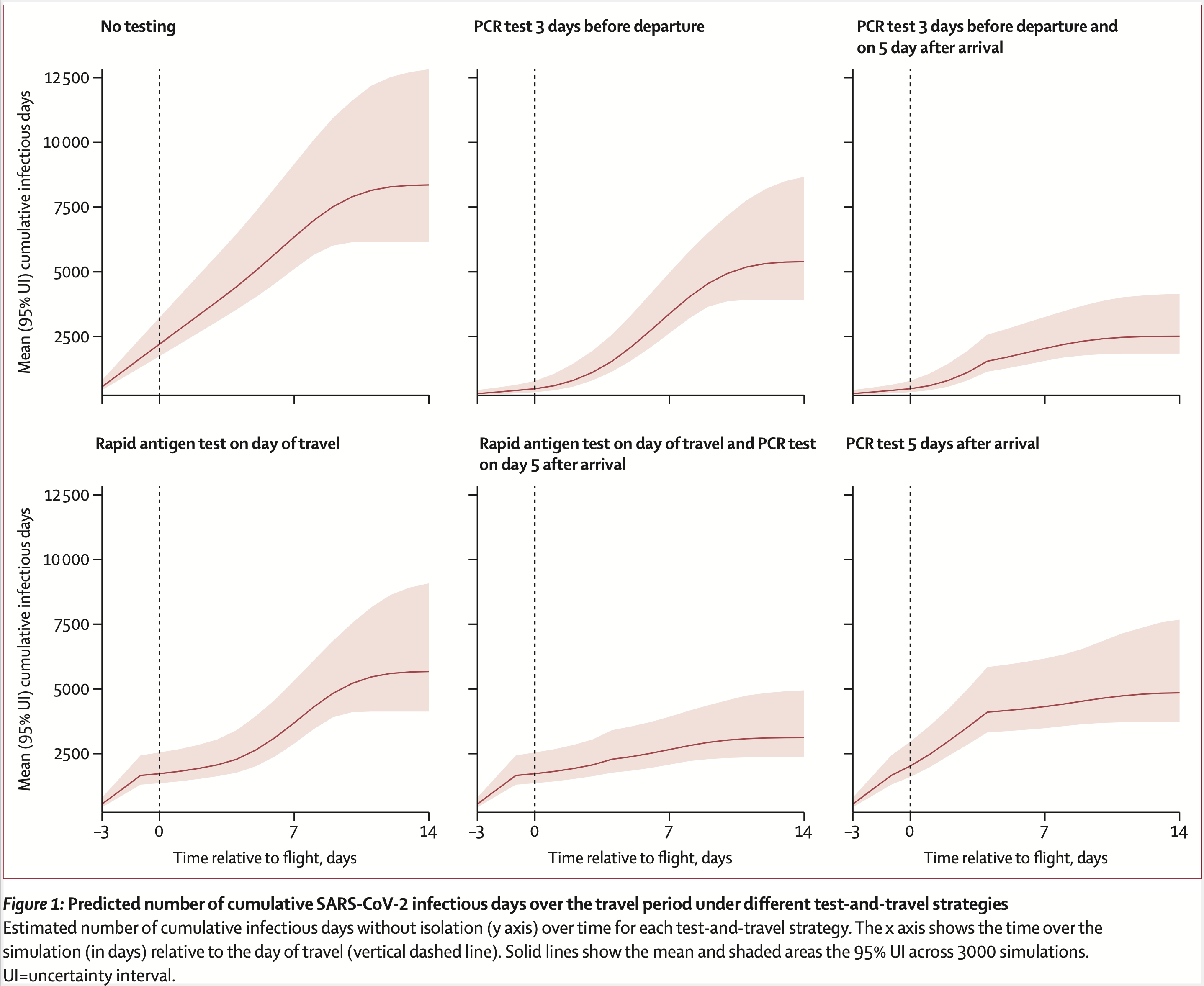
Our new The Lancet Infectious Diseases paper is out. We used microsimulation to evaluate different testing and quarantine strategies for air travel. The simulation incorporates day-specific test sensitivity, asymptomatic infections, and differential levels of adherence to self-quarantine. Given all the travel for holidays and spring break, we’re hoping it provides some useful insight for airlines and public health departments.
Comparing epidemics

In all likelihood, the US will end up with more (direct) deaths from COVID-19 than the “opioid epidemic” since 1999.
Using the CDC WONDER data for opioid deaths and the NYTimes data for COVID-19, I show the cumulative deaths (y-axis) from all opioids (blue) and from COVID (red) over time (x-axis).
UPDATE: On March 2, 2021, the US has had more confirmed COVID-19 deaths than all opioid-related deaths 1999 to 2019. My back-of-the-envelope estimates suggests we will easily pass the 2020 opioid-related deaths by the end of April.
Student’s Tay Distribution
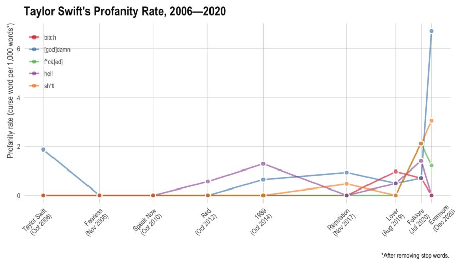
Taylor Swift has recorded 9 albums, each of them (except the most recent) has gone multi-platinum. In total, she has sold over 200 million records, won 10 Grammy’s, an Emmy, 32 AMA’s, and 23 Billboard Music Awards. Not bad for somebody who just turned 31.
This year, she’s managed to release two albums — they’re both very good. However, I noticed there seemed to be more profanity than I had remembered on her older albums. Here, I’ll use tidytext to see if she has actually increased her rate of profanity or if I’m simply misremembering things.
My collaboration network for 2010 to 2020 (+ other plots)
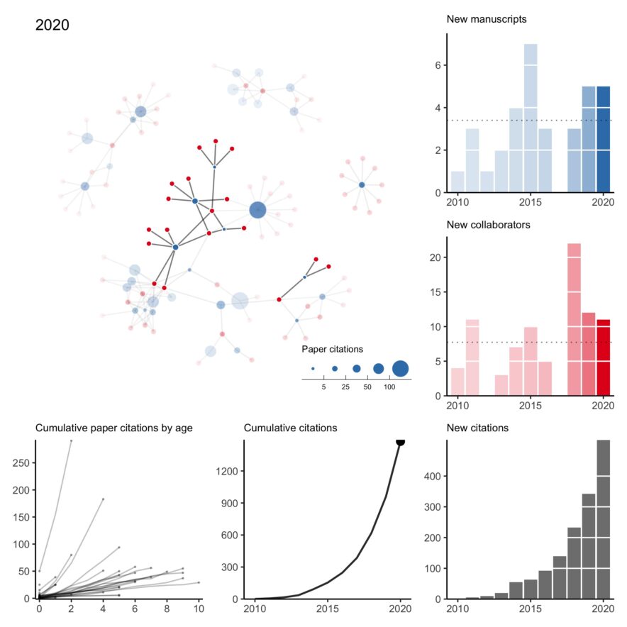
In what has become a bit of an annual tradition, here is my collaboration network for 2010 to 2020. This year was rough. Of the two first-author papers published this year, one was pre-pandemic. I think it’s fair to say this wasn’t the level of productivity I was expecting of myself. Hopefully, a few projects still in the pipeline will come out early next year.
All that said, I’m thankful for a strong network of kind collaborators who picked up my slack when necessary, checked in on me even when we didn’t have an active project, and understood when childcare issues caused last minute Zoom cancellations.
You’ll have plenty of time to work with famous, smart, and/or fun people — 2020 was a good reminder of the importance of working with kind people.
Comparing daily (direct) COVID-19 deaths to other causes of death
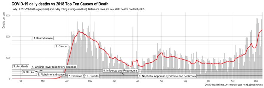
It’s easy to get numb at this stage of the pandemic, but a friendly reminder that daily COVID-19 (direct) deaths have been consistently higher than 8 of the top 10 causes of death (in 2018) since April.
We’re on track for over 3,000 deaths per day by Christmas (!!) — things are not good.
Applying an intro-level networks concept to deleting tweets
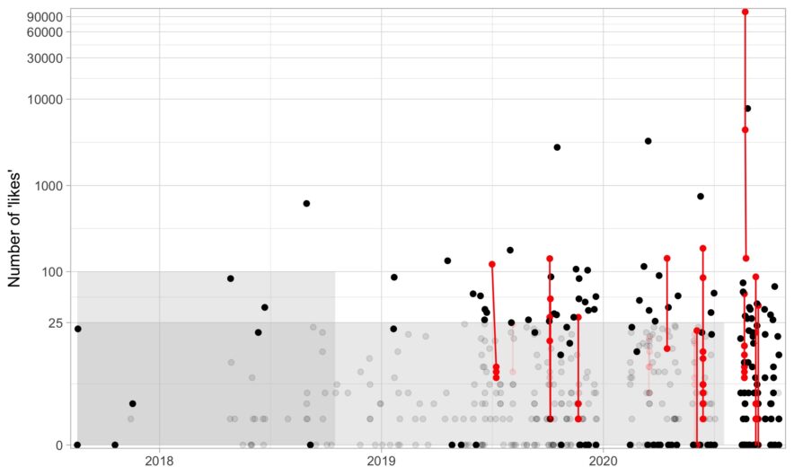
There are a few services out there that will delete your old tweets for you, but I wanted to delete tweets with a bit more control. For example, there are some tweets I need to keep up for whatever reason (e.g., I need it for verification) or a few jokes I’m proud of and don’t want to delete.
If you just want the R code to delete some tweets based on age and likes, here it is (noting that it is based on Chris Albon’s Python script). In this post, I go over a bit of code about what I thought was an interesting problem: given a list of tweets, how can we identify and group threads?
Things to consider before applying for a K99/R00
It officially looks like I’ll be awarded a K99/R00 (!!). The application process was a long, overwhelming slog — only possible with the generous support of mentors, colleagues, friends, and strangers.
Here, I will try to pay it forward by sharing some thoughts and advice. There are plenty of good blog posts about applying for K99’s, so I’ll try to avoid repeating those. Instead, I’m going to focus on things I didn’t know before and/or didn’t read elsewhere. It will be based on (1) insight from others who applied, (2) advice from mentors of successfully funded applicants, and (3) my interpretation from reading about 20 K-award summary statements and applications (both funded and unfunded).
If there’s enough interest in the topic, I might write about the writing process itself, but here I’m going to focus on things to do before you apply. The tl;dr is (1) consider non-K99 options, (2) apply early in your postdoc, (3) give yourself more time than you think you’ll need, (4) be strategic about your target institution, and (5) avoid easy critiques.
Our new paper about opioid prescribing patterns in the US
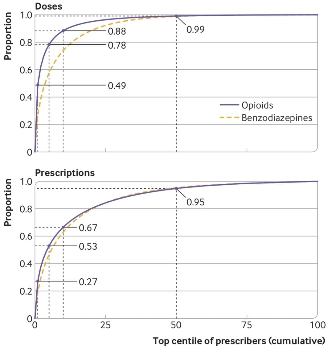
Some notes about a new (open access) paper with Keith Humphreys, Mark Cullen, and Sanjay Basu — “Opioid prescribing patterns among medical providers in the United States, 2003-17: retrospective, observational study” — just published in BMJ.
Collaboration network from 2010 to 2019
I have been trying to wrap my head around working with temporal networks — not just simple edge activation that changes over time but also evolving node attributes and nodes that may appear and disappear at random. What better way than to work with a small concrete example I’m already very familiar with?
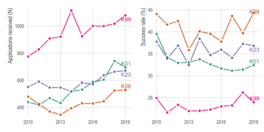
Quick look at NIH K-award funding
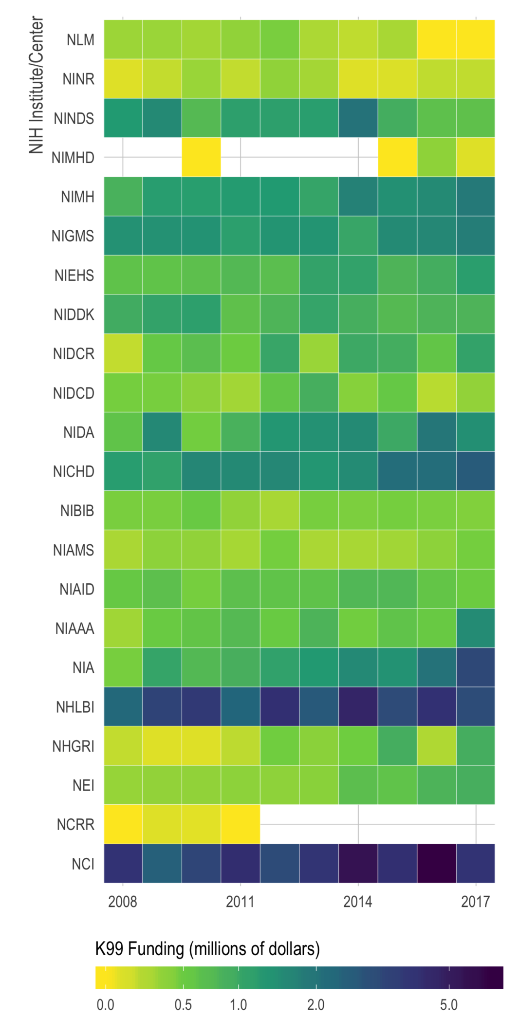
Motivated by a chat with Maria Glymour, I took a quick look at NIH K-award funding rates. It’s a very exploratory/descriptive look, but all the code is up on my GitHub. I’m hoping to find time to dive into the data more at some point.
Just putting it here, with no commentary, in case others who are applying for K’s might find it useful.
UPDATE: Since this post, I applied for, and received, a K99 — check out that blog for more up to date numbers and a new Shiny app.
My Collaboration Network
My Twitter timeline is blowing up with #NetSci2018 tweets and awesome visualizations this week, so I was inspired to see if I can quickly make my own “gratuitous collaboration graph” (as Dan would say).
Hover over each node to see the name of the paper (red), co-author (blue), or other project (green for data and orange for software).
Our NEJM paper “Mortality in Puerto Rico after Hurricane Maria”
Here is a non-exhaustive list of materials related to our new paper in New England Journal of Medicine, “Mortality in Puerto Rico after Hurricane Maria.” While I normally just link to my papers, this particular paper garnered a significant amount of attention and was viewed over 100,000 times. Not all the attention was good, accurate, or fair — but that is for another post.
Looking at opioid-related mortality, by race, 1979 to 2016
Our paper (with Monica Alexander and Magali Barbieri) is out now (in published ahead-of-print form). Monica has a great, short Twitter thread on the findings so if you don’t want to read the whole thing, check that out. The publisher’s PDF is here.
After submitting our paper, the NCHS released the 2016 multiple cause of death files — so a couple months ago we were curious to see how (or if) our results would change when adding the 2016 data.
[NOTE (2/25/2019): Since this post, the 2017 data have also been released. I did a similar analysis comparing our original paper with the additional two years of data. See this post here or our Github repo.]tldr; San Diego weather is better than Boston weather
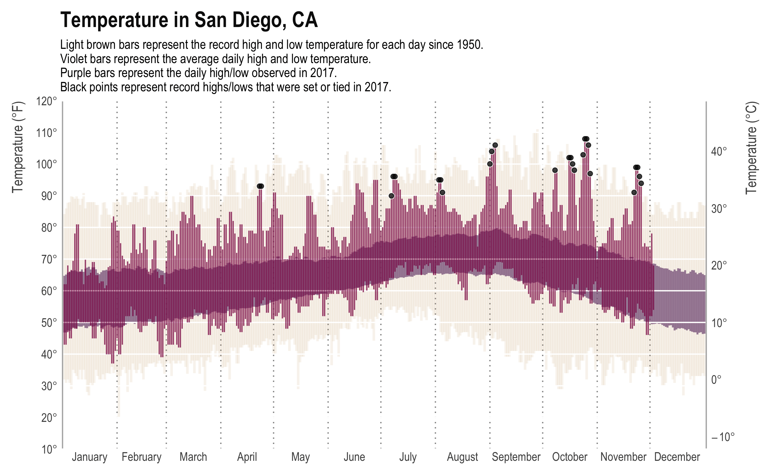
I am taking a break from a crazy couple months of writing and coding by… writing code. Just a quick post comparing weather in Boston (where I am) to weather in San Diego (where I’m from).
While the New York Times may have made the original, most data viz people will recognize the plot above from Tufte’s classic, Visual Display of Quantitative Information. It presents a ton of data in a clear, concise, and appealing way. The background bars show the record high and low daily temperature, the mid-ground bars show the “normal” (though as far as I can tell, normal is never clearly defined) high and low temperature, and the foreground shows the high and low for that year. In addition, we have annotations for days that met or made the record. The original plot even had a subplot for daily precipitation.
Here is a similar plot for Boston:
Replacing decimal points with interpuncts in MS Word
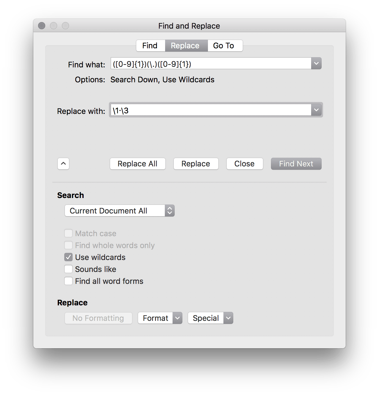
It turns out Microsoft Word’s “Advanced Find and Replace” is quite… well, advanced. You can actually use regex to do relatively complex find and replace functions. For example, The Lancet requires that all decimal points be middle dots (i.e., interpuncts). This is pretty trivial in LaTeX or Rmd and turns out it’s equally easy in Word.
Just use ([0-9]{1})(\.)([0-9]{1}) as your search query and \1·\3 as your replacement with the “Use wildcards” option.
We (as a field) should still be moving over to doing our drafting in Rmd or LaTeX though. The bloat on MS Word makes working with moderate sized manuscripts with figures painful.
Using R, Wikipedia, and SHERPA/RoMEO to show New England Journal of Medicine‘s pre-print statement is empirically false
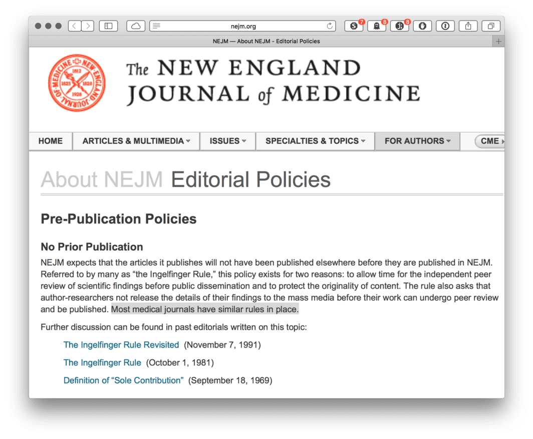
One of the most fundamental aspects of collaborative research is sharing your work with others through pre-print or conference presentations. This isn’t likely to be news to anybody doing collaborative research these days, and many journals have become increasingly permissive with their pre-print policy. For example, Nature released an editorial making it clear, “Nature never wishes to stand in the way of communication between researchers.[…] Communication between researchers includes not only conferences but also preprint servers. The ArXiv preprint server is the medium of choice for (mainly) physicists and astronomers who wish to share drafts of their papers with their colleagues, and with anyone else with sufficient time and knowledge to navigate it. […] If scientists wish to display drafts of their research papers on an established preprint server before or during submission to Nature or any Nature journal, that’s fine by us.”1 Other prestigious journals have similar policies—for example, The Lancet, Science, PNAS, and BMJ. (The list goes on and on.)
One such journal does did not. New England Journal of Medicine (Figure 1).
UPDATE: Since this post, NEJM has changed their position and pre-prints are allowed.
Using a histogram as a legend in choropleths
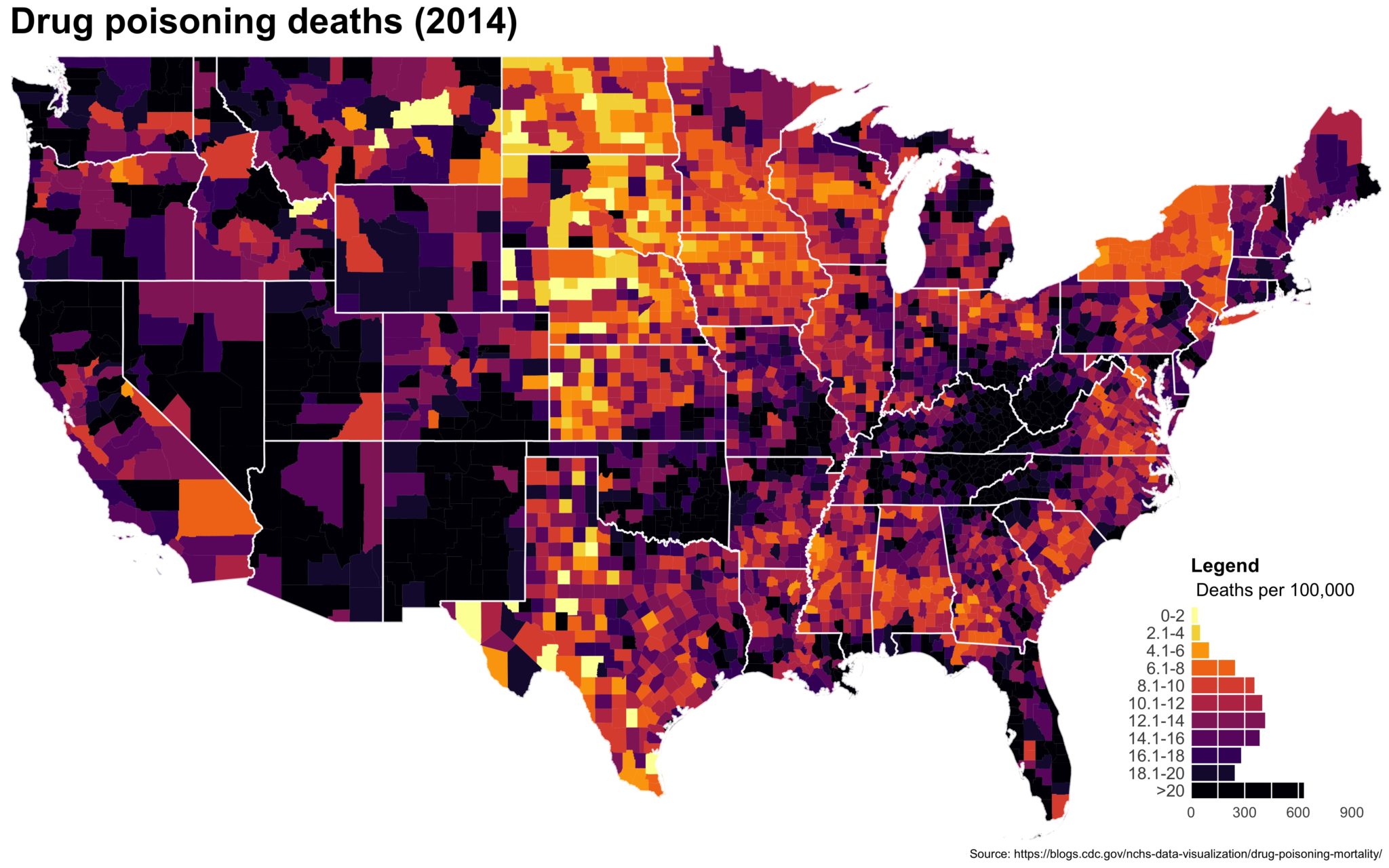 Despite well known drawbacks,1 plotting parameters onto maps provides a convenient way of seeing context, patterns, and outliers. However, one of the many problems with choropleths is that the area of the regions tend to distort our perception of the value of the region. For example, in the United States, huge (in terms of land mass) counties will tend to have a greater visual impact than small counties (despite often having similar or even smaller population sizes).
One way to address this is to use a histogram as a legend on your map. The histogram then provides you with a way of showing raw counts of equal weights while the map allows you to provide the spatial context of the values.
Use bash to concatenate files in R
Often, I find I need to loop through directories full of csv files, sometimes tens of thousands of them, in order to combine them into a single analytical dataset I can use. When it’s only a few dozen, using fread(), read_csv, or the like can be fine, but nothing is quite as fast as using awk or cat.
Here’s a snippet of code that allows one to use bash in R to concatenate csv files in a directory. People in the lab have found it helpful so maybe others will as well.
A visual tour of my publications
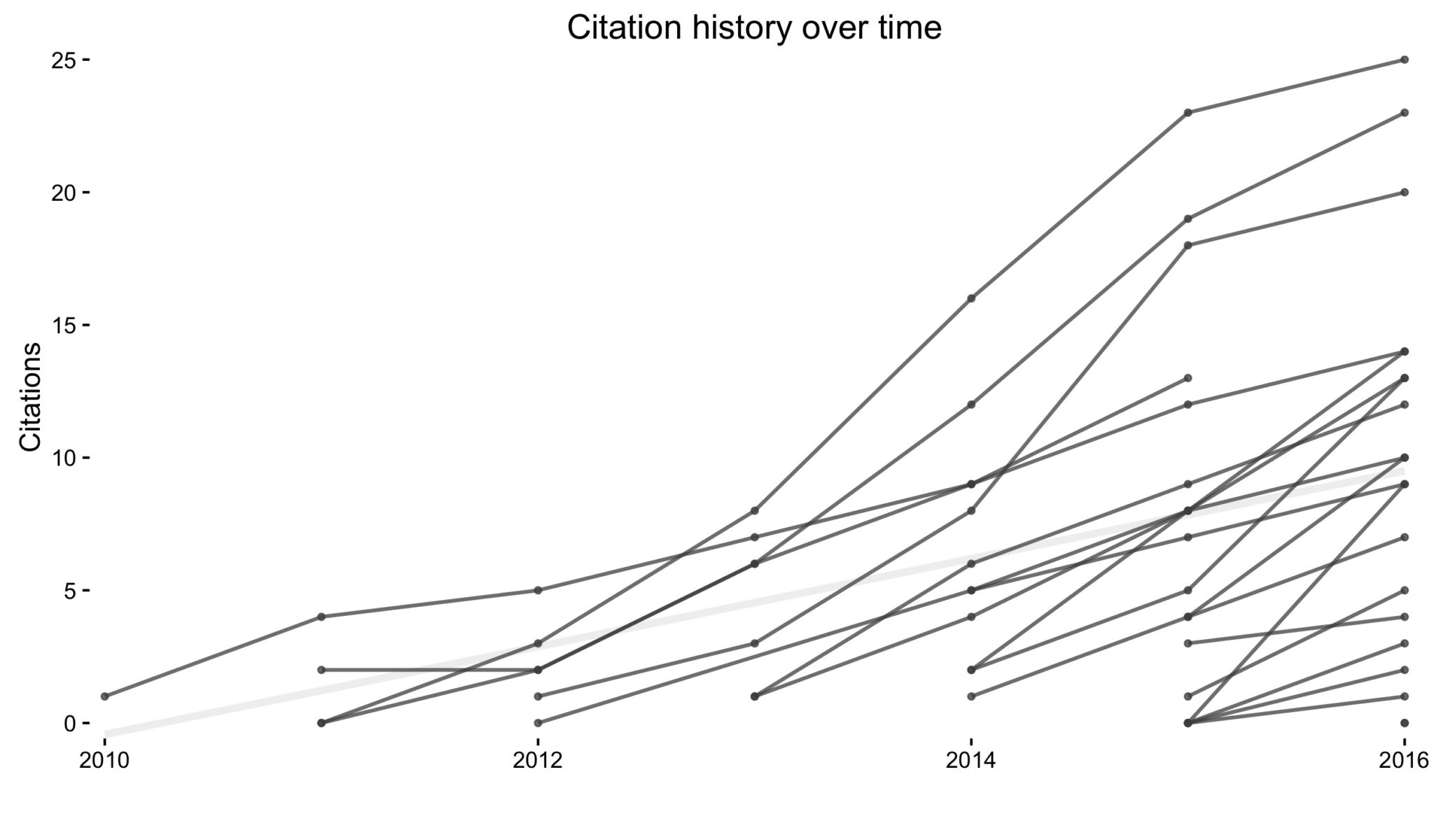 I recently came across this paper by Michal Brzezinski about (the lack of) power laws in citation distributions. It made me a little curious about the citations of my own articles so I threw together a little script using James Keirstead’s Scholar package for
 R. In the plot above, every line represents a single article with time on the x-axis and (cumulative) number of citations on the y-axis.
It’s not super informative, so we can break it down a few ways to graphically explore the data.
Converting Slack’s Team Directory into virtual contact cards
I spent the summer as a fellow at University of Chicago’s Data Science for Social Good Fellowship (more on that later) where I got to work on optimizing EMS delivery in Cincinnati (additional press). I’m looking forward to talking about it more once the code and official blog post are made public.
Until then, I’m just going to throw up some random code snippets that resulted from the summer.
The colon operator really is the fastest.
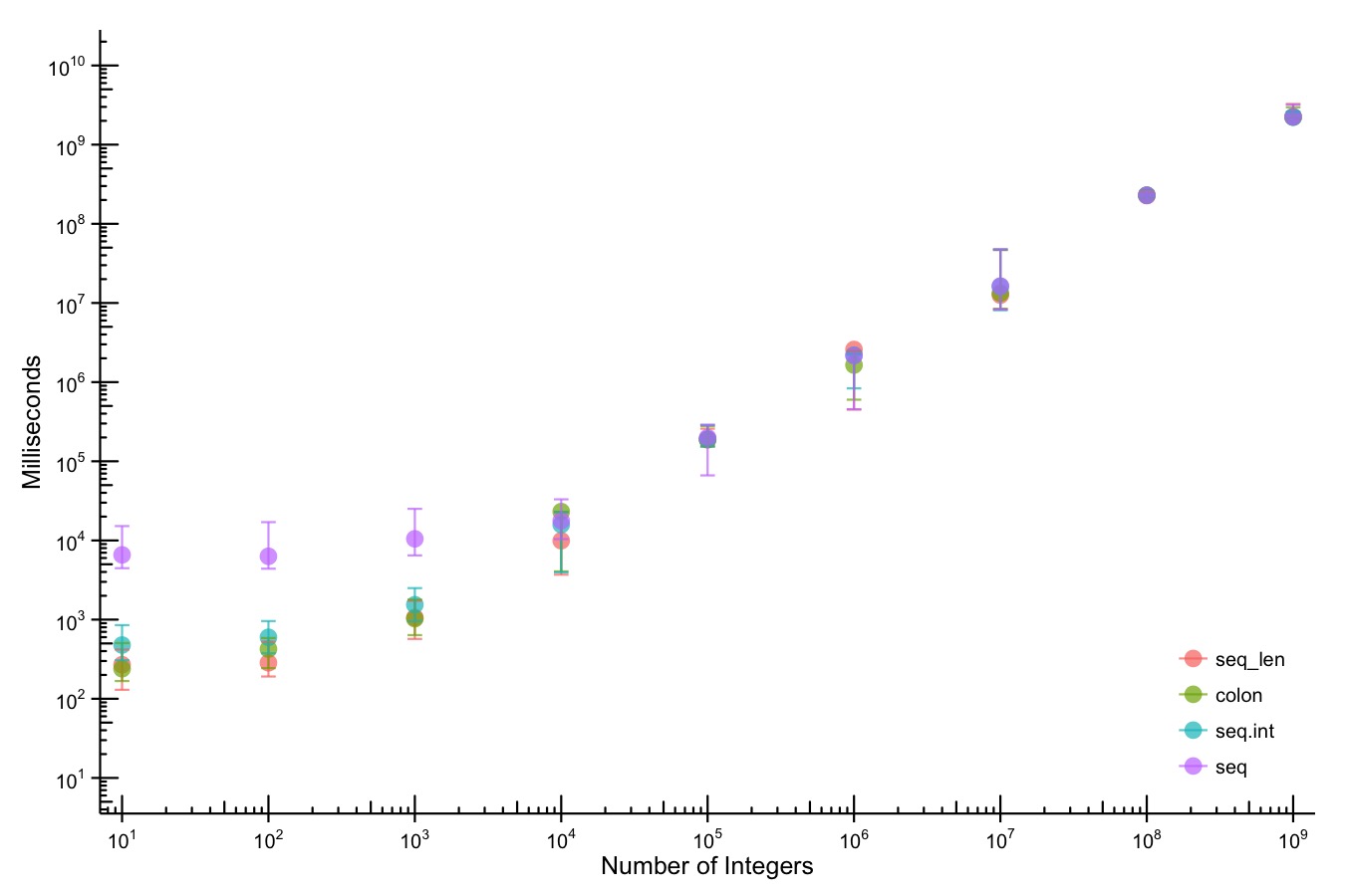 Way back when I was first learning
 R, I ran across an old listserv post that talked about how the colon (:) operator was the fastest way to generate a sequence. I never really thought about it, but I got in the habit of always using it whenever I needed a sequence.
Waterfalls of Eligible Singles
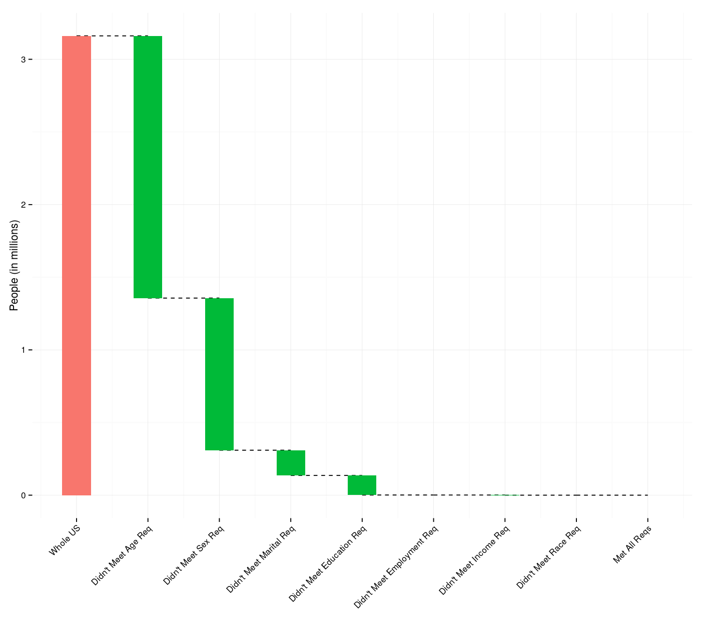 As a Valentine’s Day (gag) gift to one of my friends, I created a
 Shiny app1 that will calculate the number of people in the United States who meet specified sex, age, marital status, race/ethnicity, educational attainment, employment status, and annual income requirements.
Shiny + deSolve = Interactive ODE Models
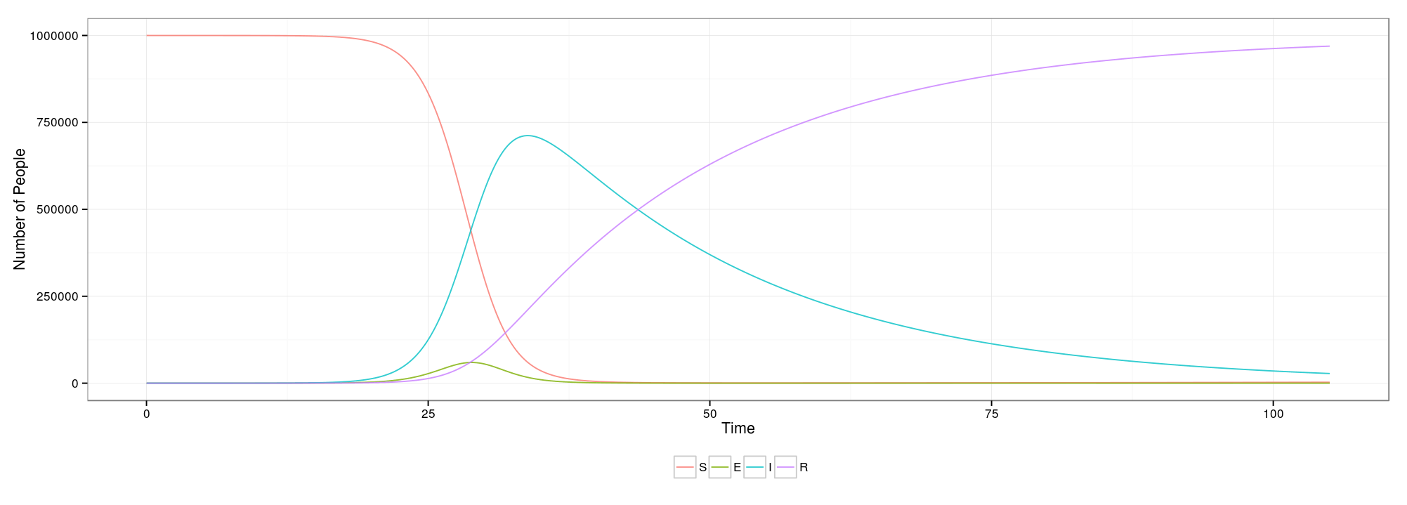 While taking a disease dynamics course, I thought it would be a good opportunity to learn how to use the
 Shiny package in R and create an interactive interface for some of my problem sets. After a few trial runs with smaller, simpler setups, I have wrapped up the side project (for now). You can see it in action here 1 and you can view the final code on my Git.